Crossfit Plywood Wall Lacquered
Project Highlight: Crossfit Plywood Wall Lacquered

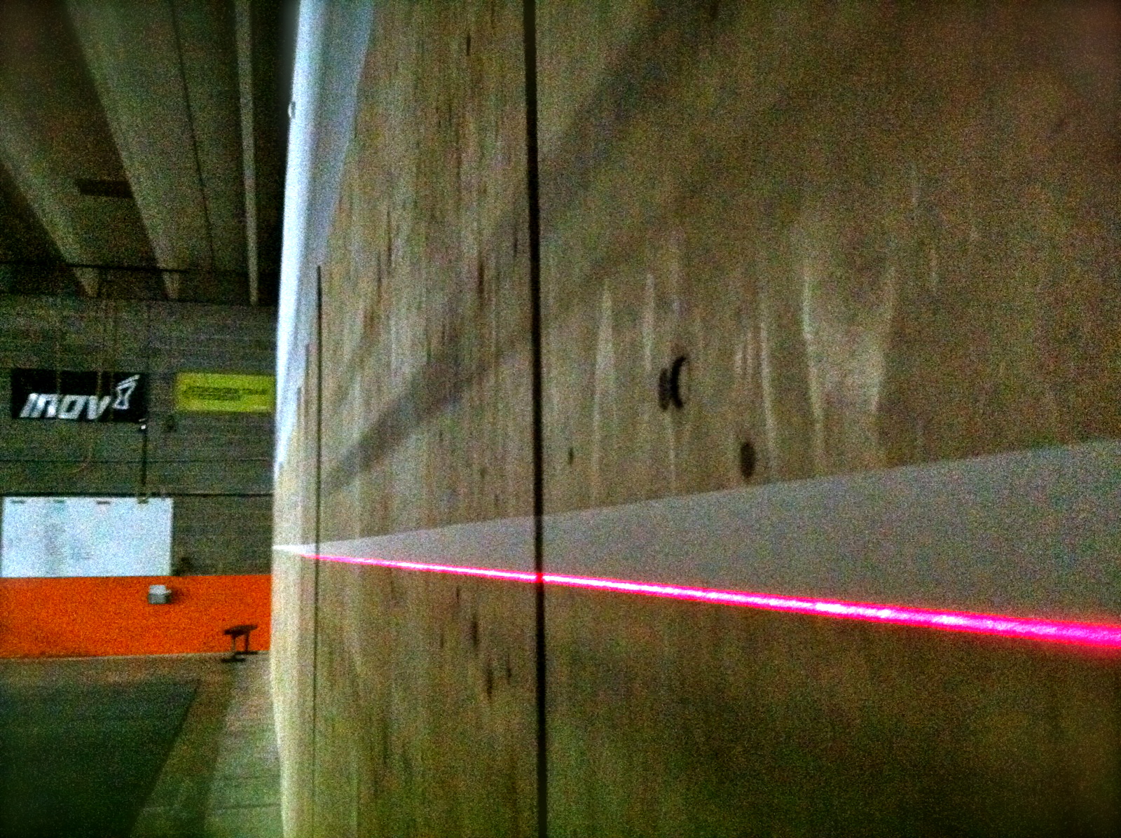
We were hired to do some work at a local gym, Crossfit Pandora’s Box. If you know nothing about Crossfit, know it can be a little intense. This wall is used by hundreds throughout the week to perform handstands, handstand pushups, wall balls and other types of physical expenditure. Unfortunately the wall was getting rough and people were picking splinters in their backsides. NOT fun.
We were called in to figure out how to make the wall smooth and stand up to the beating it will receive. We chose lacquer.
Greg grabbed a laser level to make an amazing line. The line is below the point where an inverted person’s shoes will hit. This will keep the finish from chipping.
He then masked the line.
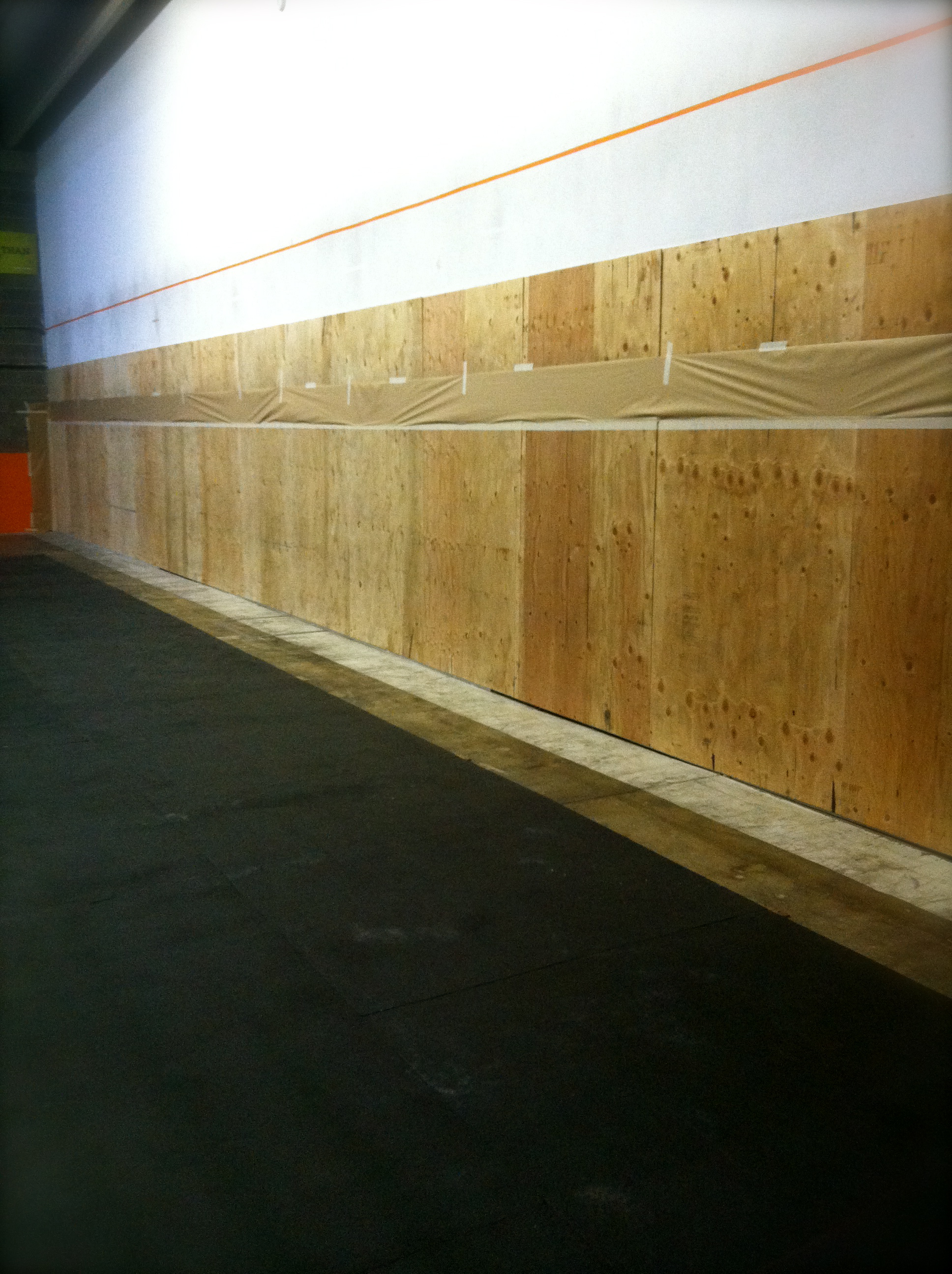
He and one of 0ur team members applied five coats of lacquer and the results were surprisingly gorgeous. I mean, doesn’t that plywood look amazing? Not to mention its super smooth finish.
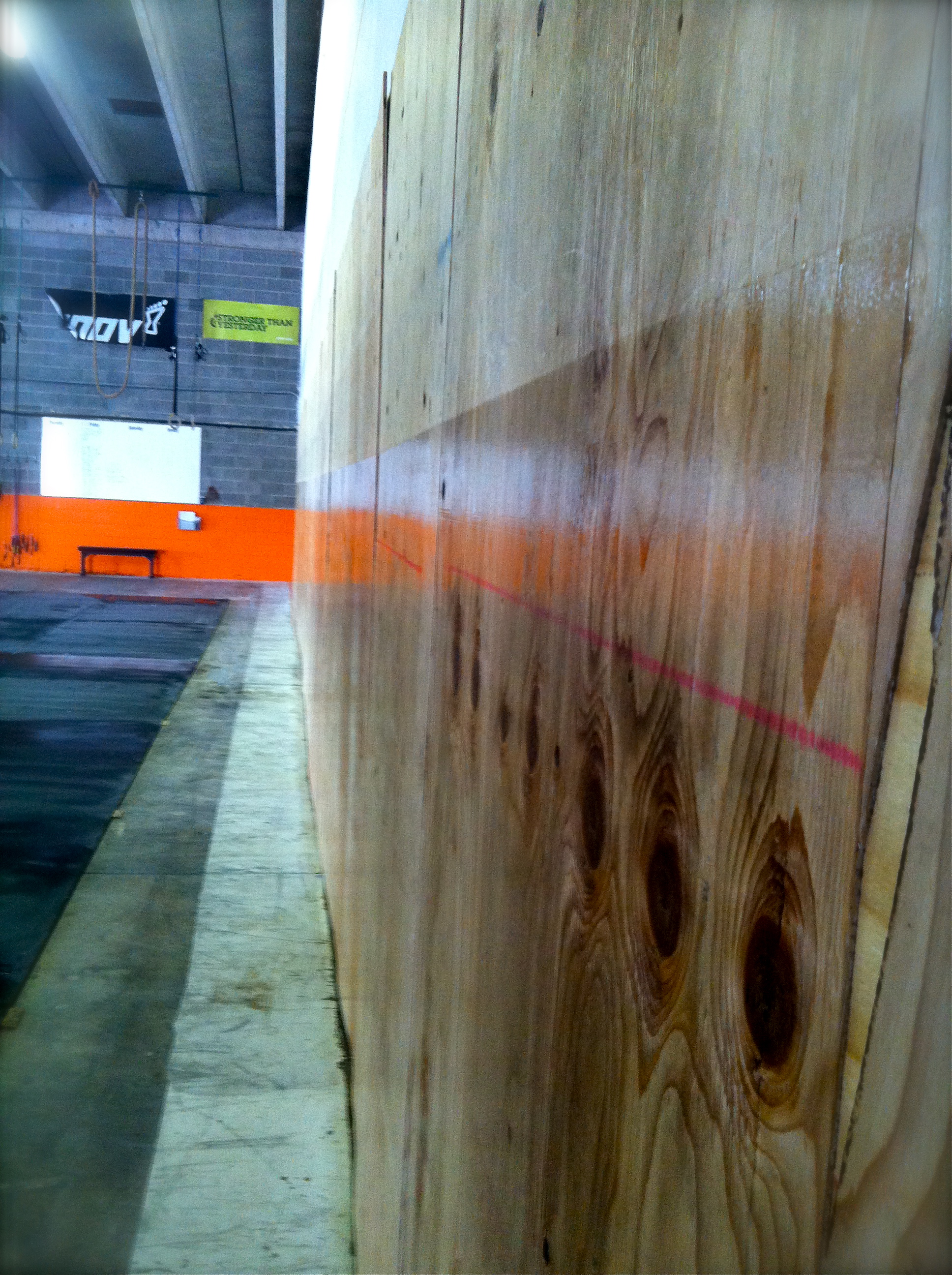
We know a few Crossfit Pandora’s Box athletes who will be thrilled not to have to worry about splinters anymore!
Find this post interesting? Hit the LIKE button and share with your friends!

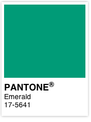
Paint Color of the Year 2013 Aloe
Aloe is the HOT color of 2013!

Sherwin Williams Aloe (SW 6464)
This year Sherwin-Williams and other professional paint companies announced Aloe (SW 6464) as the color of the year. Closely related to the Pantone color of the year, Emerald, Aloe is a light vintage green color. In fact, it’s part of the color collection Vintage Moxie at Sherwin-Williams.
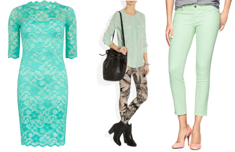 If you follow women’s fashion, or shop in a department store, or have looked on Pinterest recently you will see “mint” colored pants, dresses, shirts, home accessories splattered all over! Aloe is a slightly more gray version of mint which keeps it from looking neon or juvenile on your walls.
This color is what we call a pseudo-neutral. It can be paired with a lot of other colors and not be the center of attention. Because of it’s vintage appeal it will look classic, yet fresh for years.
Pair Aloe with
- Neutrals
- Metallic
- Natural textures and colors
- Brighter colors like coral, yellow, blue
- Emerald green
I’m considering painting my office this color—just to liven things up!
We always recommend getting a sample of the paint and either using a product like Small Wall® to see where in your home you’d like it best.
SHARE WITH US: Are you going to give a trendy color like Aloe a try on your walls at home?

Paint Your House to Sell on a Tight Budget
Getting ready to sell your home but on a tight budget?

You can save bundles painting it yourself!
You can paint your house interior yourself. There, we said it. Lots of people do it. And sometimes you just can’t afford to hire a painter and a Realtor®.
The tips we share in this post could save you bundles over hiring a professional. But understand these ideas are akin to having a bad hair day and wearing a hat. Wearing a hat doesn’t fix your hair, it’s still unruly and may look worse after you take the hat off, but it improves the impression you give.
This post talks about interior painting only. We recommend using a professional to help you with any exterior paint work.
- Fill nail holes and drywall screw holes before painting. Check out this brief video on how to do it properly.
- Clean trim and doors. Get a Magic Eraser at your local store and go to town. It is abrasive so exercise prudence. You can also make a 1:1 vinegar and water solution and wipe everything down using a soft cloth. Cut up old t-shirts to use as rags (buy some from a thrift store if you don’t have any on hand.) You may be surprised how nice it looks and that you don’t have to repaint.
- Never ever try to use old paint to touch up spots on your walls larger than a couple inches. It looks tacky because the two won’t blend. The touched-up spot will look shinier and possibly darker or lighter than the wall around it.
- For a significant wall touch up we suggest just re-painting the wall in the same color as the walls next to it. Any minor color variations between the old and new paint of the same color will be hard to detect when the corner is a divider.
- When repainting a whole room, save yourself time and materials by painting your ceilings the same color as the wall.
- It’s important to repaint closets because shoe scuffs and other marks look cheap. Use very inexpensive white paint to repaint closets.
- Only use primer when you need it. If you are covering a very dark color you will need to prime. If you are covering a metallic or stencil treatment, use primer. If you are painting something that was once stained, prime it. If you’re covering a medium to light color you don’t need to prime.
- Avoid using white paint for the walls—it looks really cold. Tan or beige is a great color against white trim. SW 6107 Nomadic Desert or SW 7712 Townhouse Tan are good to try. Give gray a shot against stained trim/doors. SW 7641 Collonade Gray or SW 7667 Zircon are good grays to sample.
- Buy paint samples to try on the wall. It can save you a lot if you’re painting a whole room and prevent you from having to repaint an off color. Some Benjamin Moore stores sell small samples for a few bucks a piece. This includes Pottery Barn colors. Sherwin Williams sells quart-sized samples. For foolproof test swatch results, try Small Wall. It is a board with adhesive backing you can use to move a paint sample from room to room. When all is said and done it is only a few bucks more than poster board and tack. Available on Amazon.com.
- Expect to spend about $100 or more on equipment. It’s worth spending the money for good tape, a Purdy angled paintbrush, the liners for the paint trays, and good tarps.
- Do not use a sprayer yourself. Brush and roll. It is cheaper, more time efficient, and more reliable than using a sprayer when not a professional.
- Only paint cabinets when your Realtor strongly recommends you do so. Do not paint your kitchen cabinets yourself. It’s easy to make them gunky and sticky and cheap looking if you aren’t careful. Having a professional do the work right the first time will save you time and materials associated with a failed DIY experiment.
Like us on Facebook or follow us on Twitter to learn our latest DIY tips and tricks.
Disclaimer: We never promise you’ll make more money painting your home before you sell. We are also not responsible for any mistakes or problems you come across when doing a project yourself. Always defer to the recommendations of your Realtor. They know your market and what is selling. Our advice is based on what we’ve been asked and what we know to be true in Colorado Springs which heavily suburban.
Best Tip For Choosing Countertop Colors and Floor Colors
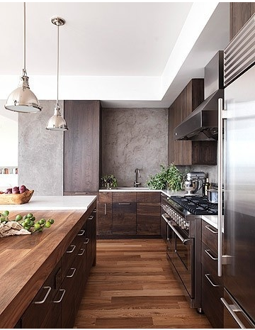
Via Pinterest
We’ve worked with our share of homeowners who are in the process of remodeling and upgrading their homes. You’d be surprised how many times we’re asked our opinion on home finishes.
There’s a lot to think about when choosing a surface type, including the color. In working with designers and other construction professionals we’ve learned a thing or two. This is why I’m so excited to share with you the BEST tip I’ve heard for choosing countertop colors and floor colors.
FLOORING
When Greg and I were choosing our floor we both LOVED the darker wood. It was super popular on all the decorating shows. Then we met our flooring expert. They said, “The best thing you can do is take a handful of dirt from outside, some of the debris you sweep up, and pet hair and put a little on each sample.” So the key to finding a forgiving floor is as easy as finding the one that best hides the dirt. I felt like, “DUH!”
Turns out most of Colorado’s dirt is very light—almost sand-like. It would show like crazy on a dark floor. But my chocolate lab’s hair would appear like brown fluffy hair clouds on a light floor. Not cute. The best choice for us? A medium tone wood floor with lots of grain. It is so forgiving and has made my cleaning stress level decrease. I’ve swept up considerable debris and dog hair that I couldn’t see—gross! But so cool.
COUNTERTOPS
The reasoning and process for finding a forgiving countertop is similar.
Get your samples out and lay them on your current counter.
Collect some of your crumbs and the like you’ve wiped from your countertop when cleaning.
Take those crumbs and spread them on your samples.
Now step back. Which one hides these little particles best? There you go.
We had a good friend who really wanted dark countertops that were basically one color. Those would have shown fingerprints, streaks, and crumbs all day every day. So unless he wanted to clean them all the time he needed to find a more forgiving counter surface. He still chose a dark one, but with the tip I just shared, he chose a different surface pattern (lines, specks, etc.) to hide little offenders. And he has thanked me over and over.
We are experienced painters. If you live in the Colorado Springs area, contact us NOW to get your free paint estimate!
Disclaimer: You are responsible for your choices. What we provide here is for entertainment purposes. If you choose a color of anything and you don’t like it, that’s not our fault.

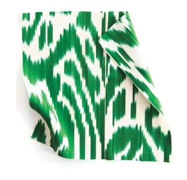
2013 Color of the Year Emerald: 4 Ways to Bring it Home
Did you know there IS a color of the year each year?
Well, 2013’s color of the year is Emerald green. This is why you see it used everywhere. Textiles, clothing, pillows, bedding, and paint.
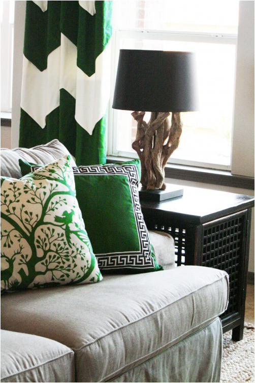
How do you use it without your home looking like a set from The Wizard of Oz? Here are four tips to bring this trend into your home successfully.
Bold wall color
Very bold wall color as a backdrop for simple, graphic furnishings will transform your space. If you really love emerald, this is a great way to embrace the trend.
Textiles
 If you’re less committed to the trend but want to liven up a space, try adding emerald curtains, pillows, and throws. You’ll need more than just one splash of the color for it to make sense.
Furniture
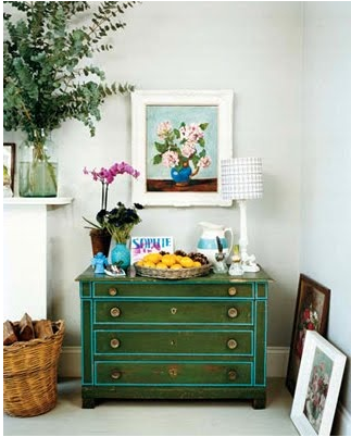 Adding one piece of furniture in a bold color will draw the eye. Why not paint a great Craigslist find a bold emerald color? It may very well become your favorite piece of furniture. Dressers, tables, and chairs are fairly easy to paint and don’t take up a huge amount of visual space. Want more impact? Paint a hutch or your cabinets.
Accessories
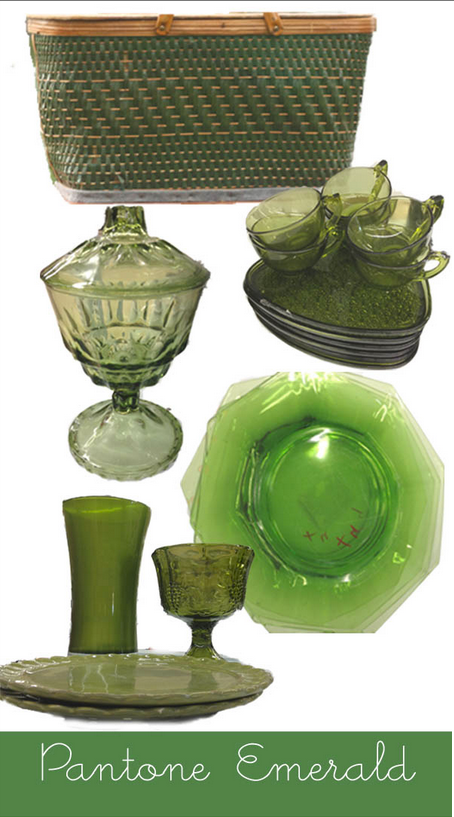 Like the trend but don’t want to re-do your whole space? Grab a few emerald accessories. Place settings, tablecloths or runners, knick-knacks, vases, and trays can say more than a bold wall. Treat them like the actual emerald jewel and spread them around your space.
These examples and more inspiration are all found on our Pinterest board Green with Envy.