Tips for Accenting Fireplaces with Paint
Tips for Accenting Fireplaces with Paint
All images can be found on our Pinterest board
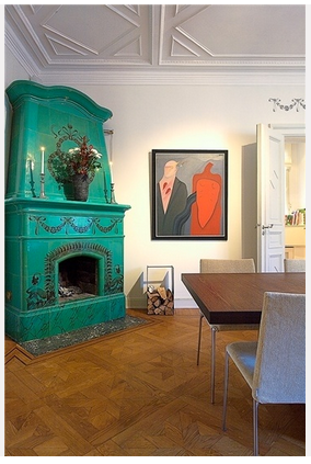
Thinking about using color to bring out your fireplace?
Let’s be honest. Sometimes neutral colors and builder paints, while nice, don’t do certain architectural features justice.
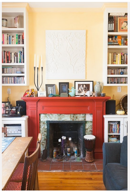
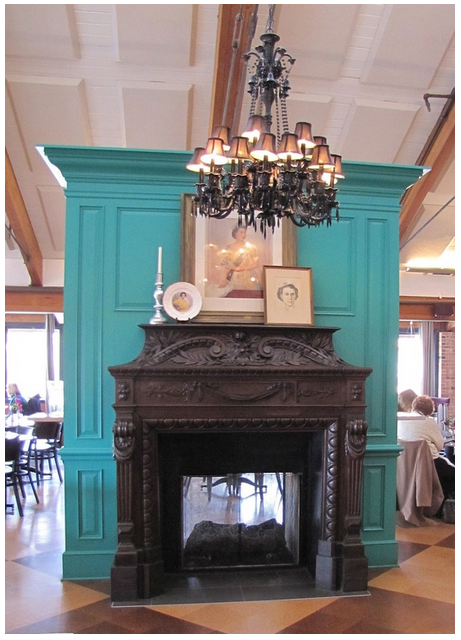
One feature is the fireplace. In many homes the fireplace is a focal point. It exudes comfort and conversation. Having a little fun with accent colors can make your interior memorable and inviting.
It is also a great place to play with bolder colors. You can really make a splash and if you want to change it in a few years, it’s less expensive and lower commitment than painting a full room.
 We recently painted a fireplace for a homeowner and it completely transformed the space. Check it out!
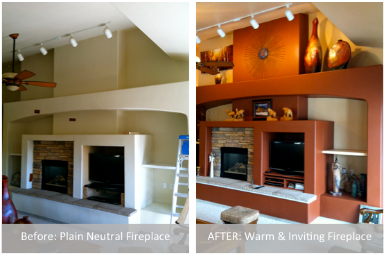
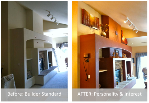 If you’re thinking of painting your fireplace here are a few tips:
- Does your fireplace have visual interest? If it seems boring or under scale, price out having a wood façade added to give it more presence.
- Is the fireplace a feature you want to highlight? When you go bold your eye and the attention of your guests will be drawn there. Make sure you’re ready to accessorize so the fireplace looks intentional.
- Choose a color you already have in your décor. If you already have accent colors in your decorating, place that color on your fireplace to pull it all together.
- Consider painting the surround a bold color and leaving the fireplace neutral. This can achieve the same effect.
 For inspiration, check out our Pinterest Board: Painted Fireplaces.
Would you paint your fireplace surround a bold color? If so, what color would you do?
Crossfit Plywood Wall Lacquered
Project Highlight: Crossfit Plywood Wall Lacquered

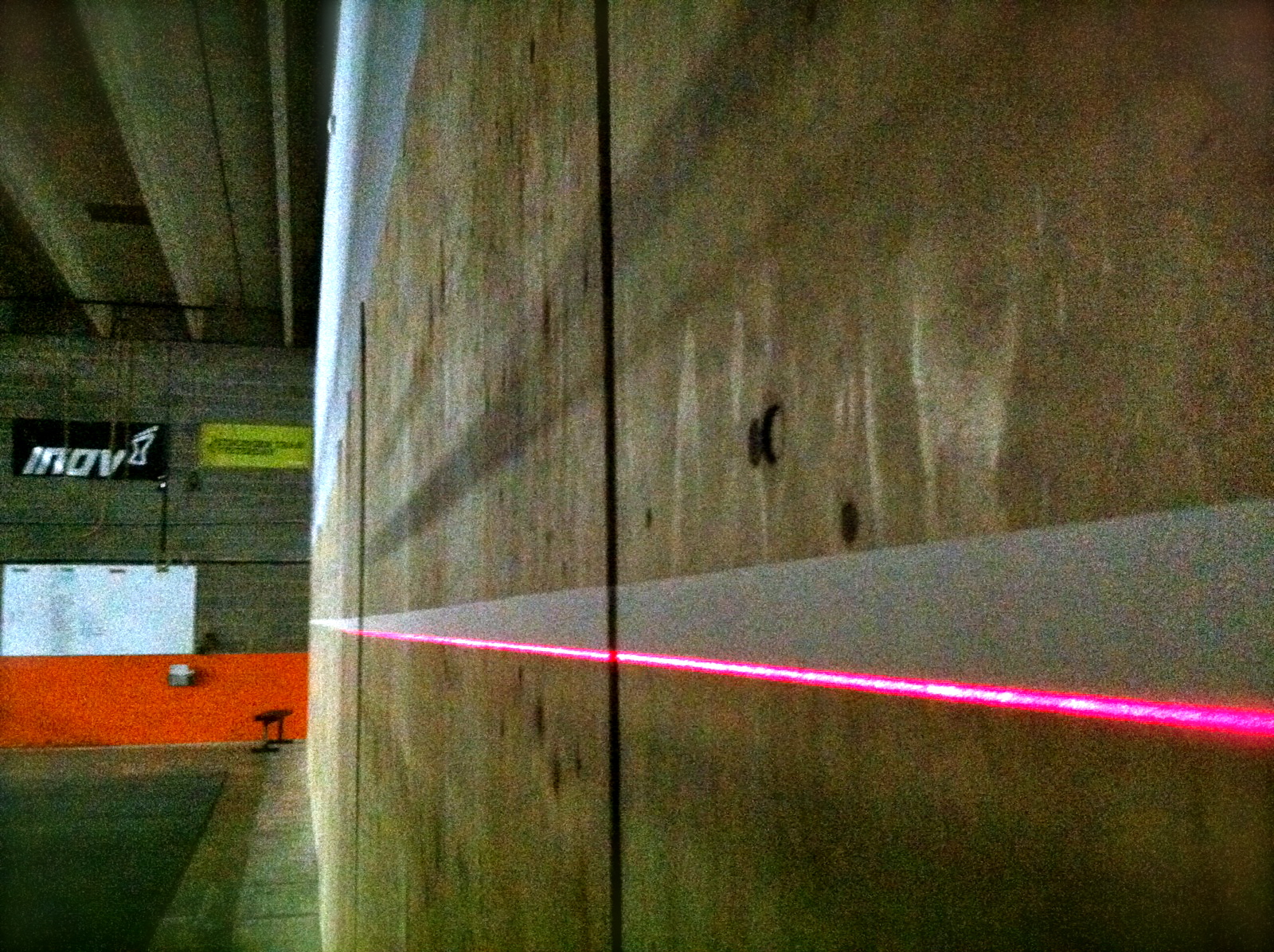
We were hired to do some work at a local gym, Crossfit Pandora’s Box. If you know nothing about Crossfit, know it can be a little intense. This wall is used by hundreds throughout the week to perform handstands, handstand pushups, wall balls and other types of physical expenditure. Unfortunately the wall was getting rough and people were picking splinters in their backsides. NOT fun.
We were called in to figure out how to make the wall smooth and stand up to the beating it will receive. We chose lacquer.
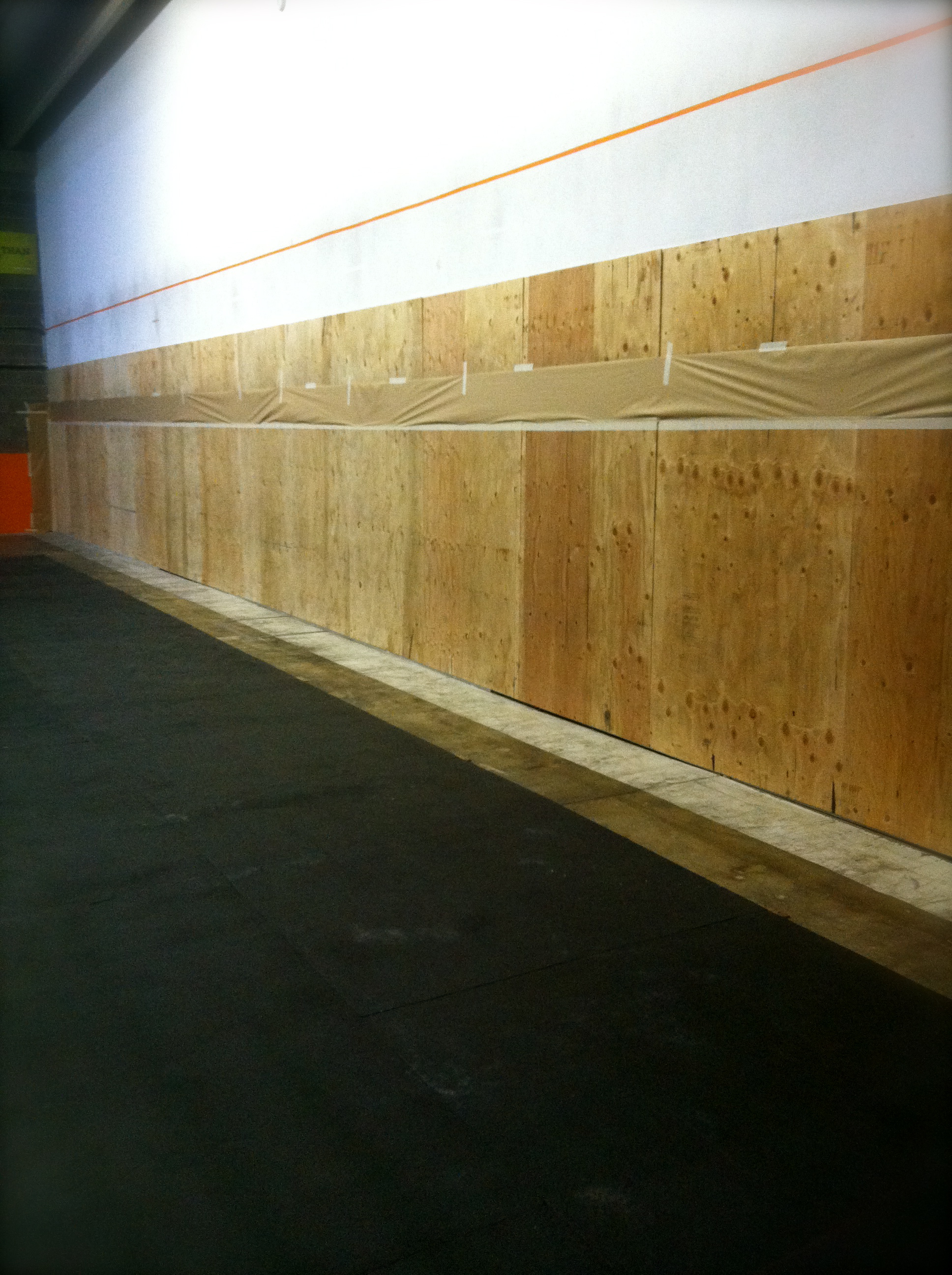
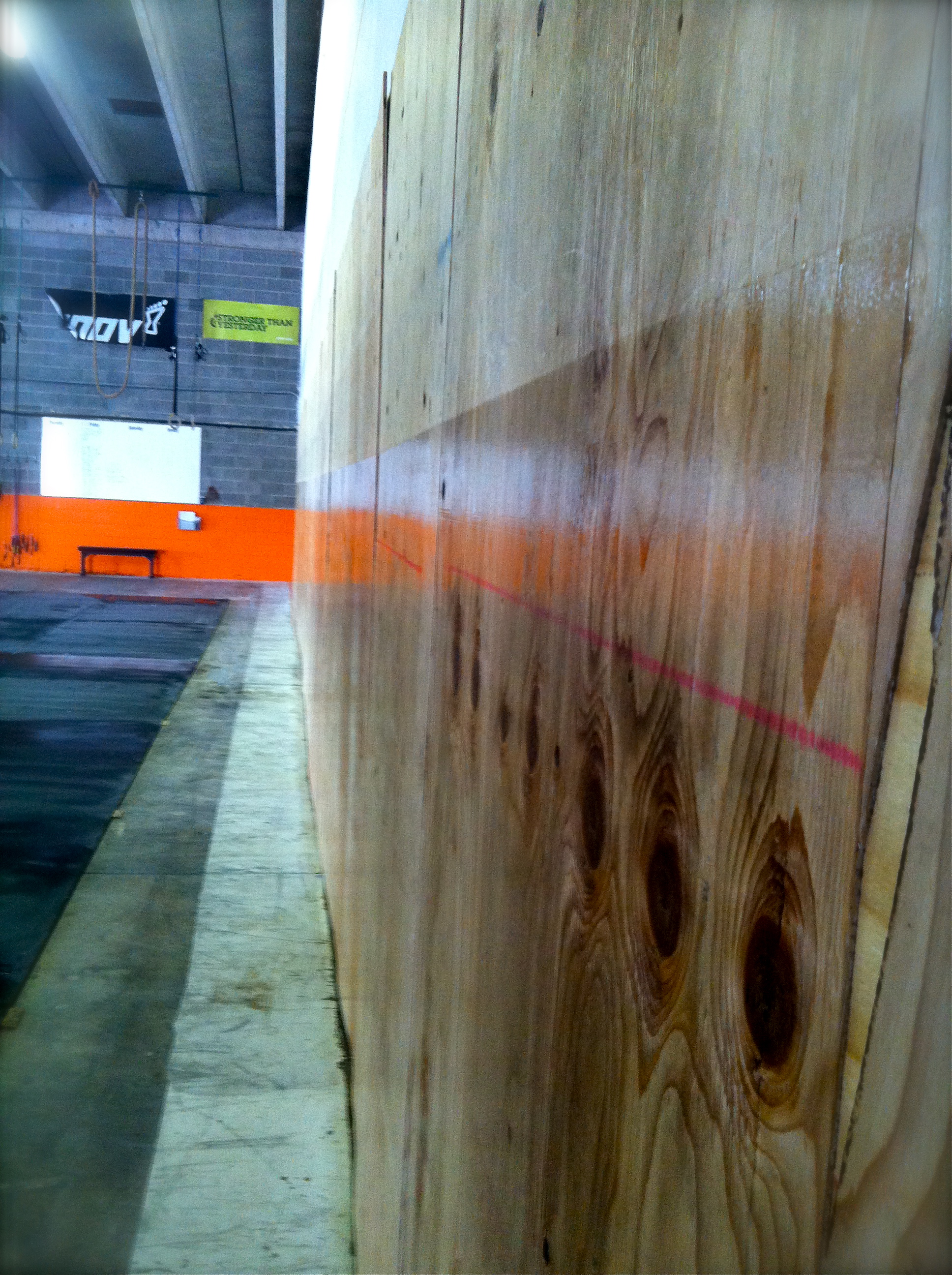
Greg grabbed a laser level to make an amazing line. The line is below the point where an inverted person’s shoes will hit. This will keep the finish from chipping.
He then masked the line.
He and one of 0ur team members applied five coats of lacquer and the results were surprisingly gorgeous. I mean, doesn’t that plywood look amazing? Not to mention its super smooth finish.
We know a few Crossfit Pandora’s Box athletes who will be thrilled not to have to worry about splinters anymore!
Find this post interesting? Hit the LIKE button and share with your friends!
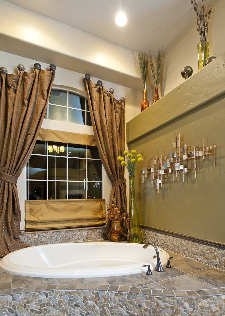
Flying Horse Home
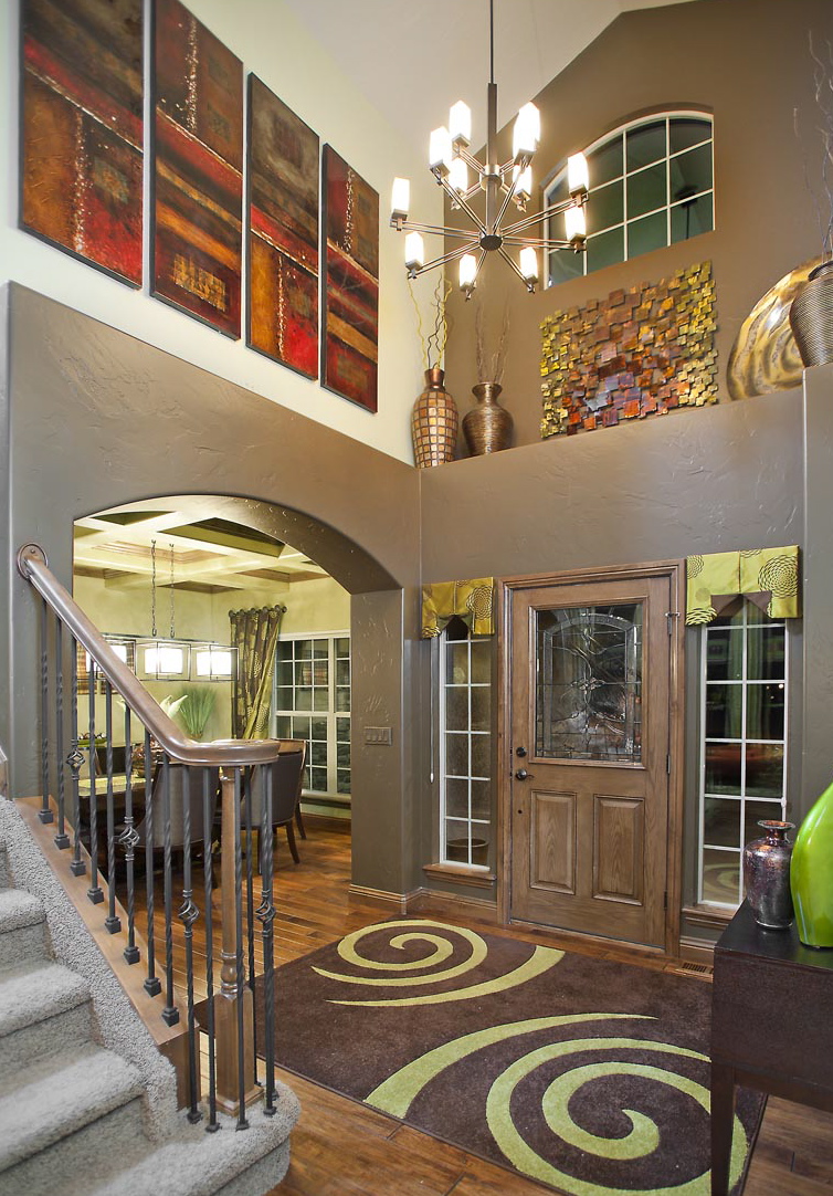
Created crisp lines so the dark accent color pops in this entry.
This house is splashed all over our Web site!
The house was built like other track homes. But then Cheryl Windom of Windom Interiors was hired to transform the space. The homeowner LOVED bright, bold colors and having each room look polished. It matches his personality. Every room in this home was painted by A Quality Paint Job.
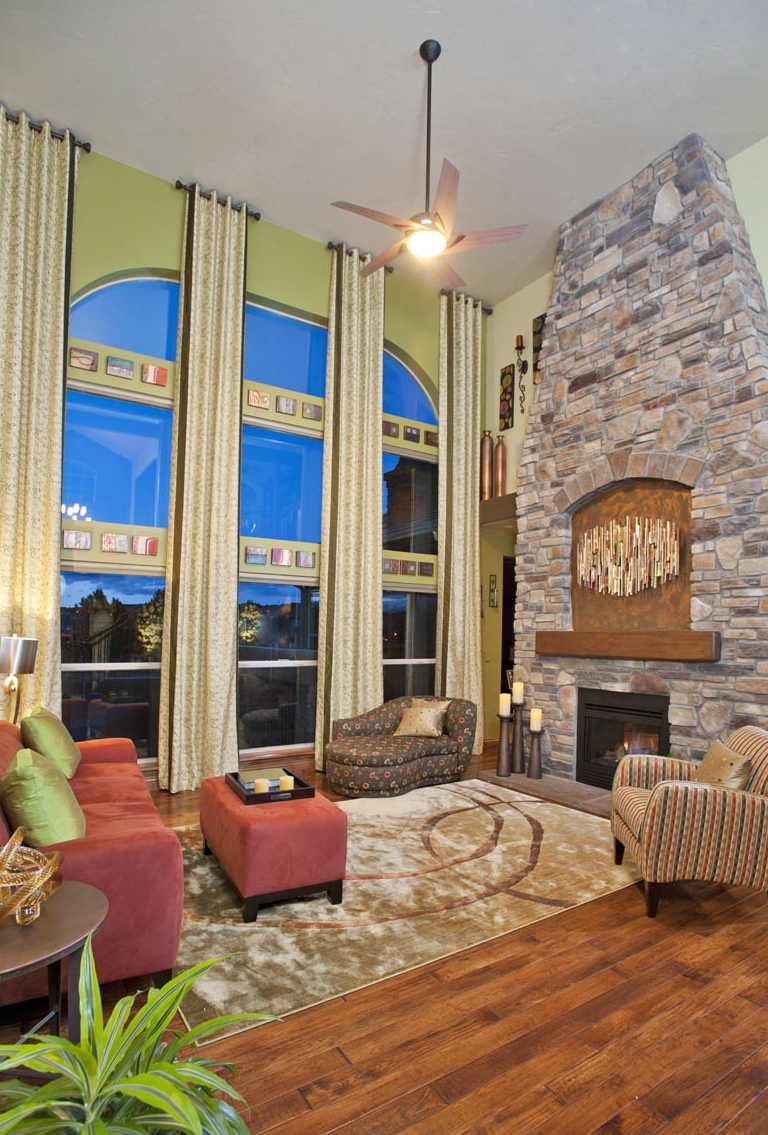
Cheryl chose a bold green that permeated the main living areas.
Painted walls and accent ledge feature.
The master suite is a much subtler hue. The earthy brown colors anchor each space. This house boasts an outdoor lower level bar and waterfall.
We enjoyed working with Cheryl and the homeowner to create an unforgettable space. We get a spring in our step when we get to use fresh new colors and see big transformations at the end of the job.
A special Thank You to Joel Strayer for use of these fantastic photos!
Check out our photo gallery for more images of this stunning home!
Pink Striped Nursery
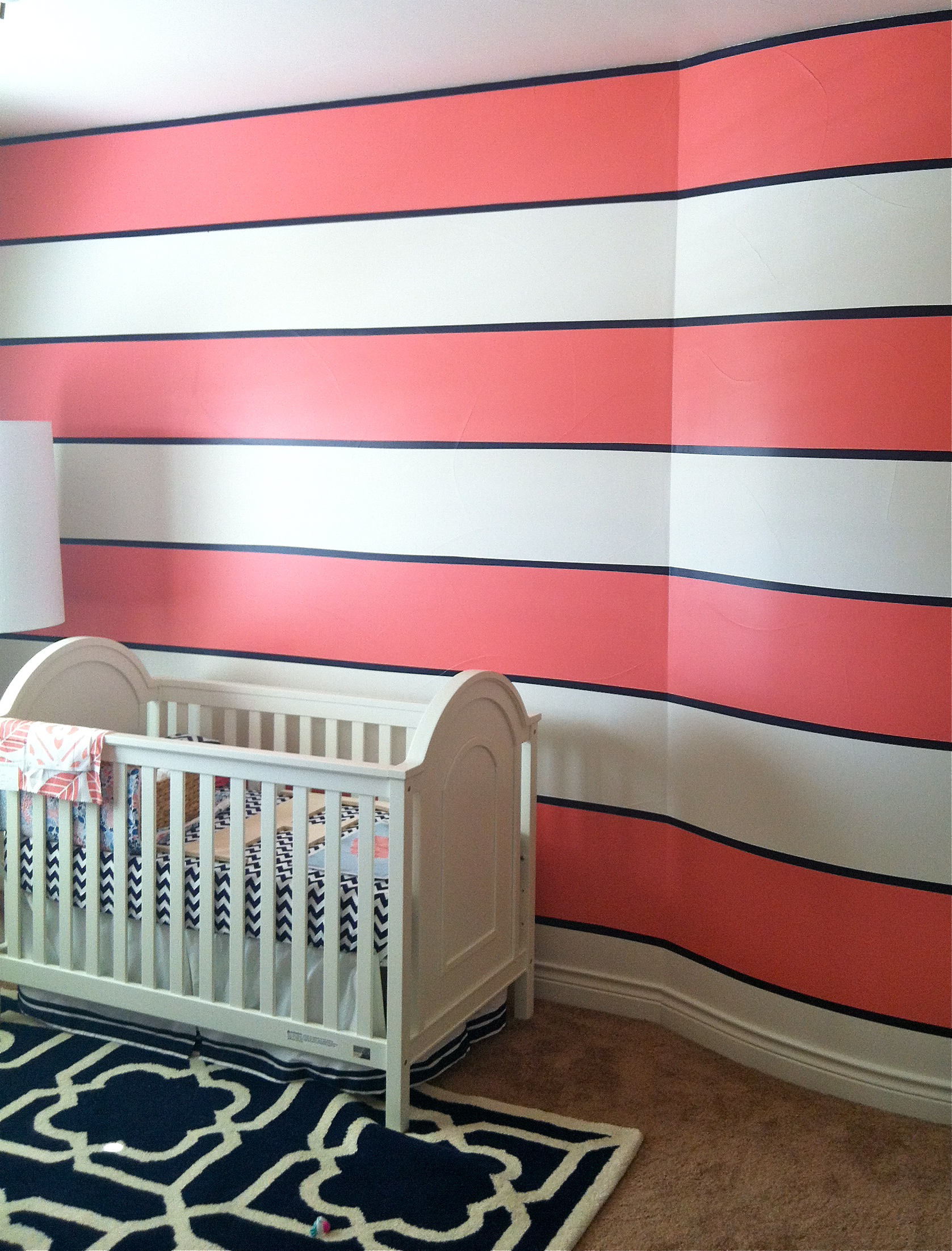
It’s always fun to meet homeowners who want to do something a little bit different.
To welcome their newest family addition, a baby girl, they asked us to help them create a fun, modern nursery.
They chose a bright coral pink and crisp navy blue to create vivid stripes. As you can see, it’s coming together great with a white crib and navy geometric rug.
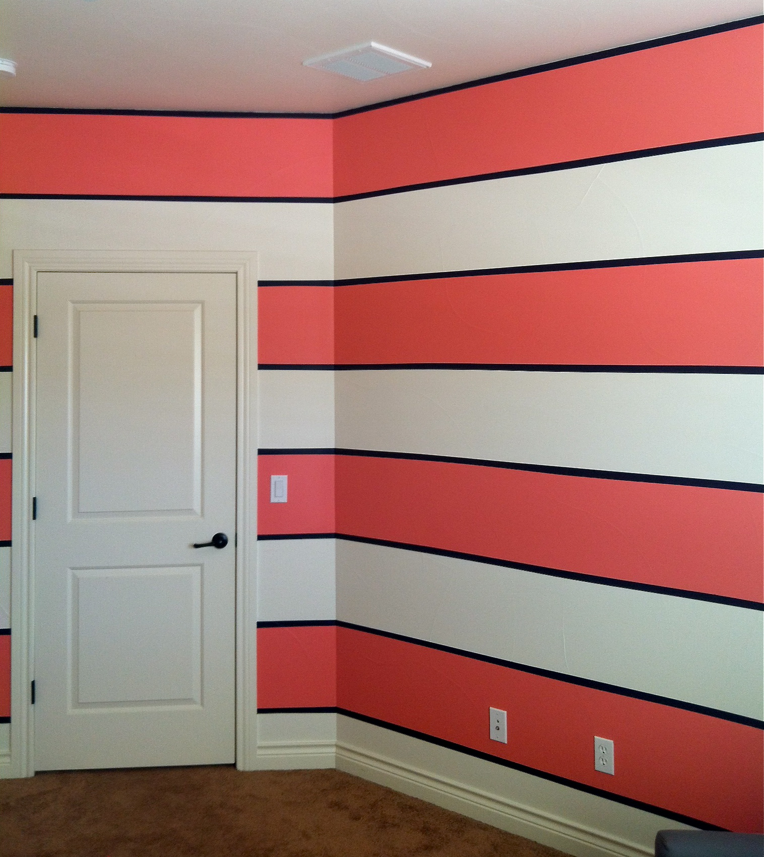 We had so much fun on this project because it required exceptional attention to detail.
Sweet dreams little baby girl!
Check out our Pinterest board Baby Nursery Insipiration. We just pinned a bunch of striped baby rooms. So cute!