
Paint Color of the Year 2013 Aloe
Aloe is the HOT color of 2013!

Sherwin Williams Aloe (SW 6464)
This year Sherwin-Williams and other professional paint companies announced Aloe (SW 6464) as the color of the year. Closely related to the Pantone color of the year, Emerald, Aloe is a light vintage green color. In fact, it’s part of the color collection Vintage Moxie at Sherwin-Williams.
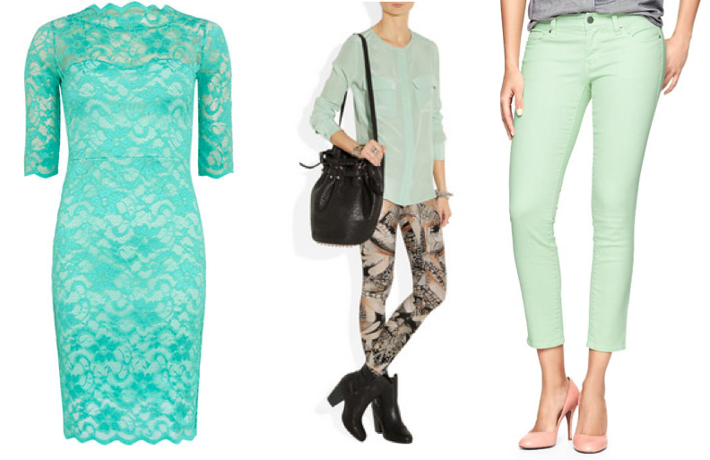 If you follow women’s fashion, or shop in a department store, or have looked on Pinterest recently you will see “mint” colored pants, dresses, shirts, home accessories splattered all over! Aloe is a slightly more gray version of mint which keeps it from looking neon or juvenile on your walls.
This color is what we call a pseudo-neutral. It can be paired with a lot of other colors and not be the center of attention. Because of it’s vintage appeal it will look classic, yet fresh for years.
Pair Aloe with
- Neutrals
- Metallic
- Natural textures and colors
- Brighter colors like coral, yellow, blue
- Emerald green
I’m considering painting my office this color—just to liven things up!
We always recommend getting a sample of the paint and either using a product like Small Wall® to see where in your home you’d like it best.
SHARE WITH US: Are you going to give a trendy color like Aloe a try on your walls at home?
Must Know Painting Tips for Home Sellers
Everyone selling a residential property needs to know this!

Don’t put your home on the market without reading these tips.
Selling your home can be a large undertaking. Usually sellers are looking to put the home on the market investing the least amount of money while selling it for top dollar. Painting is on of the least expensive ways to improve buyer impression of your home.
We strongly recommend following the advice of a Realtor® when selling your home. Follow their advice over ours. That being said, we work with a lot of Realtors and their advice resonates with what we share.
1. Selling is about giving the buyer what THEY want. Not standing up for what you like. They need to be able to envision their stuff in your home. Remember, if all goes well, their stuff WILL be in your home and don’t expect them to keep the color on the walls as a shrine to you and your design savvy.
2. Smart color choices can loosen the pocket books of people in a competitive market. While we in no way promise increased profits or recouped costs when painting your home to sell, we’ve seen buyers lower their offers because they expect to have to paint over a poor paint job. We’ve also seen buyers swoon over a freshly painted home.
These paint DO’s and DON’Ts are essential to attracting buyers!
DON’T be emotionally attached to your personal color choices. If you painted a wall bright orange or even a bright purple like I have, don’t expect others to be as in love with it as you are. Your neon green bathroom with stenciled lizards may have worked for you, but will likely lower your sale price.
DO find inspiration and look through photos of upscale homes that use neutral paint colors. Neutral paint colors include tan, gray, beige, and sage/olive green. Notice how light or dark they go in each color. It’s unlikely there will be very light or dark extremes. And notice how they bring color in through accessories. Imitate as much as possible.
DON’T use white paint on your walls. It is cold and sterile and shows dirt. The house we bought was painted white inside. We started painting the interior a couple days before closing and the sellers stopped by. The walls were now a gray/beige color and we had done some accent walls. Their comment: “Wow! We should have painted these colors and asked $10,000 more!” Paint your walls a tan, beige, or gray color to warm things up.
DO leave your trim and doors white or stained. Again unless they are in bad shape and you’re replacing things, stick with what you have and save some money. Use a Magic Eraser to remove scuff marks. Use a 1:1 vinegar and water solution and a soft cloth to clean the doors and trim.
DON’T forget to look at your cabinetry. If it’s really outdated or cheap looking, consider painting and adding fresh hardware. People gravitate toward white cabinets or espresso (dark brown) finishes. It’s very popular among designers to paint the top cabinets white and the lower ones an espresso color.
DO paint closets. Scuff marks and other wear and tear look cheap. Clean and fresh is the name of the game here. (Bonus: You can use inexpensive paint here and get away with it.)
DO consider painting your front door an inviting color. A front door can be a focal point for the whole exterior. Colors like red or black can give a good impression.
As a professional painter we can help your home look crisp and fresh for home buyers. If your property is in the Colorado Springs area contact us and get your FREE estimate.

Paint Your House to Sell on a Tight Budget
Getting ready to sell your home but on a tight budget?

You can save bundles painting it yourself!
You can paint your house interior yourself. There, we said it. Lots of people do it. And sometimes you just can’t afford to hire a painter and a Realtor®.
The tips we share in this post could save you bundles over hiring a professional. But understand these ideas are akin to having a bad hair day and wearing a hat. Wearing a hat doesn’t fix your hair, it’s still unruly and may look worse after you take the hat off, but it improves the impression you give.
This post talks about interior painting only. We recommend using a professional to help you with any exterior paint work.
- Fill nail holes and drywall screw holes before painting. Check out this brief video on how to do it properly.
- Clean trim and doors. Get a Magic Eraser at your local store and go to town. It is abrasive so exercise prudence. You can also make a 1:1 vinegar and water solution and wipe everything down using a soft cloth. Cut up old t-shirts to use as rags (buy some from a thrift store if you don’t have any on hand.) You may be surprised how nice it looks and that you don’t have to repaint.
- Never ever try to use old paint to touch up spots on your walls larger than a couple inches. It looks tacky because the two won’t blend. The touched-up spot will look shinier and possibly darker or lighter than the wall around it.
- For a significant wall touch up we suggest just re-painting the wall in the same color as the walls next to it. Any minor color variations between the old and new paint of the same color will be hard to detect when the corner is a divider.
- When repainting a whole room, save yourself time and materials by painting your ceilings the same color as the wall.
- It’s important to repaint closets because shoe scuffs and other marks look cheap. Use very inexpensive white paint to repaint closets.
- Only use primer when you need it. If you are covering a very dark color you will need to prime. If you are covering a metallic or stencil treatment, use primer. If you are painting something that was once stained, prime it. If you’re covering a medium to light color you don’t need to prime.
- Avoid using white paint for the walls—it looks really cold. Tan or beige is a great color against white trim. SW 6107 Nomadic Desert or SW 7712 Townhouse Tan are good to try. Give gray a shot against stained trim/doors. SW 7641 Collonade Gray or SW 7667 Zircon are good grays to sample.
- Buy paint samples to try on the wall. It can save you a lot if you’re painting a whole room and prevent you from having to repaint an off color. Some Benjamin Moore stores sell small samples for a few bucks a piece. This includes Pottery Barn colors. Sherwin Williams sells quart-sized samples. For foolproof test swatch results, try Small Wall. It is a board with adhesive backing you can use to move a paint sample from room to room. When all is said and done it is only a few bucks more than poster board and tack. Available on Amazon.com.
- Expect to spend about $100 or more on equipment. It’s worth spending the money for good tape, a Purdy angled paintbrush, the liners for the paint trays, and good tarps.
- Do not use a sprayer yourself. Brush and roll. It is cheaper, more time efficient, and more reliable than using a sprayer when not a professional.
- Only paint cabinets when your Realtor strongly recommends you do so. Do not paint your kitchen cabinets yourself. It’s easy to make them gunky and sticky and cheap looking if you aren’t careful. Having a professional do the work right the first time will save you time and materials associated with a failed DIY experiment.
Like us on Facebook or follow us on Twitter to learn our latest DIY tips and tricks.
Disclaimer: We never promise you’ll make more money painting your home before you sell. We are also not responsible for any mistakes or problems you come across when doing a project yourself. Always defer to the recommendations of your Realtor. They know your market and what is selling. Our advice is based on what we’ve been asked and what we know to be true in Colorado Springs which heavily suburban.

2013 Color of the Year Emerald: 4 Ways to Bring it Home
Did you know there IS a color of the year each year?
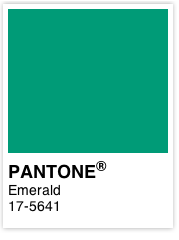
Well, 2013’s color of the year is Emerald green. This is why you see it used everywhere. Textiles, clothing, pillows, bedding, and paint.
How do you use it without your home looking like a set from The Wizard of Oz? Here are four tips to bring this trend into your home successfully.
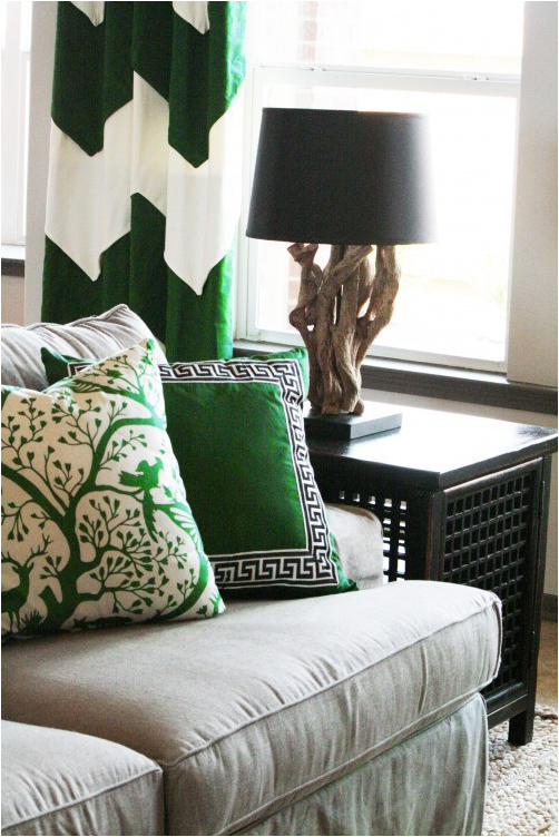
Bold wall color
Very bold wall color as a backdrop for simple, graphic furnishings will transform your space. If you really love emerald, this is a great way to embrace the trend.
Textiles
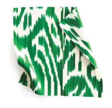 If you’re less committed to the trend but want to liven up a space, try adding emerald curtains, pillows, and throws. You’ll need more than just one splash of the color for it to make sense.
Furniture
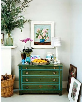 Adding one piece of furniture in a bold color will draw the eye. Why not paint a great Craigslist find a bold emerald color? It may very well become your favorite piece of furniture. Dressers, tables, and chairs are fairly easy to paint and don’t take up a huge amount of visual space. Want more impact? Paint a hutch or your cabinets.
Accessories
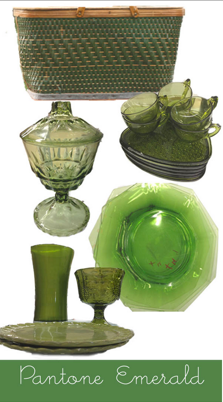 Like the trend but don’t want to re-do your whole space? Grab a few emerald accessories. Place settings, tablecloths or runners, knick-knacks, vases, and trays can say more than a bold wall. Treat them like the actual emerald jewel and spread them around your space.
These examples and more inspiration are all found on our Pinterest board Green with Envy.

3 Best White Paint Colors
3 Best White Paint Colors | A Quality Paint Job
A Quality Paint Job Shares the SECRET!
We’ve painted a lot of things white over the last seven years. White can be dynamic and warm. Check out our Pinterest board White is NOT Boring for inspiration for your space.
The top three most popular white paint colors of our customers and designers are (Sherwin-Williams colors):
#1 Extra White (SW 7006) The crisp, go-with-everything-bright-as-day white. The neutral of whites.
#2 Dover White (SW 6385) A nice, warm white–a light cream color. Looks great on cabinets and furniture, and softens ceilings, trim, and doors.
#3 Snowbound (SW 7004) This is a gray-blue white. Works well against textile and wall colors with cool undertones or in rooms where the light is very yellow.
Did you find this post helpful? Show you care and click the “LIKE” button at the top or bottom of this post.
[Disclaimer: Color choice is an intensely personal choice. Please be sure to purchase and put samples on the wall or trim you plan to paint. The information we share is just to get you started.]