Tips for Accenting Fireplaces with Paint
Tips for Accenting Fireplaces with Paint
All images can be found on our Pinterest board
Thinking about using color to bring out your fireplace?
Let’s be honest. Sometimes neutral colors and builder paints, while nice, don’t do certain architectural features justice.
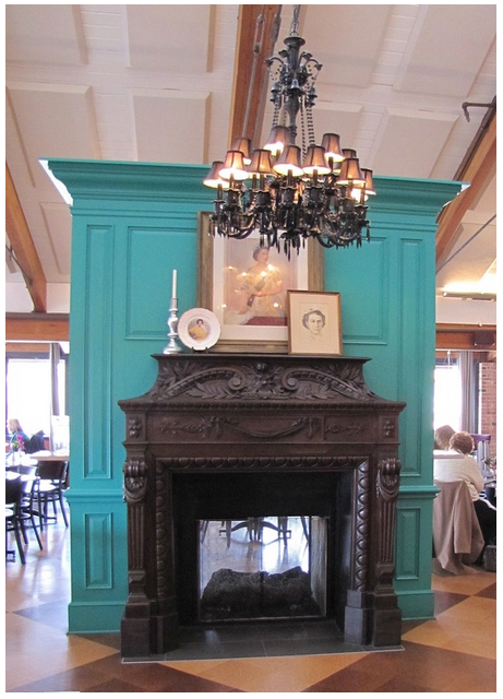
One feature is the fireplace. In many homes the fireplace is a focal point. It exudes comfort and conversation. Having a little fun with accent colors can make your interior memorable and inviting.
It is also a great place to play with bolder colors. You can really make a splash and if you want to change it in a few years, it’s less expensive and lower commitment than painting a full room.
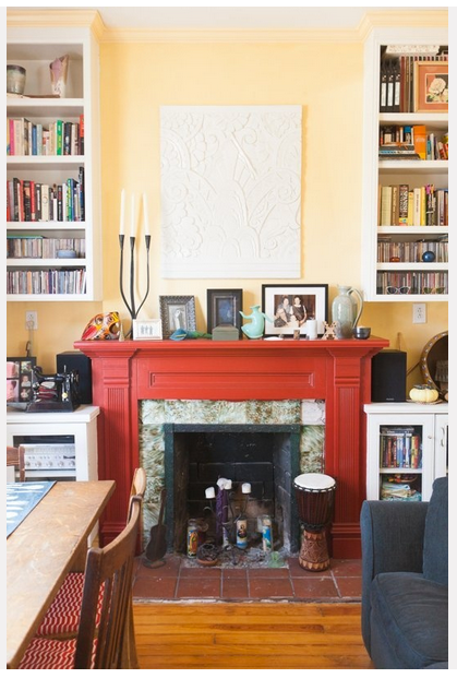
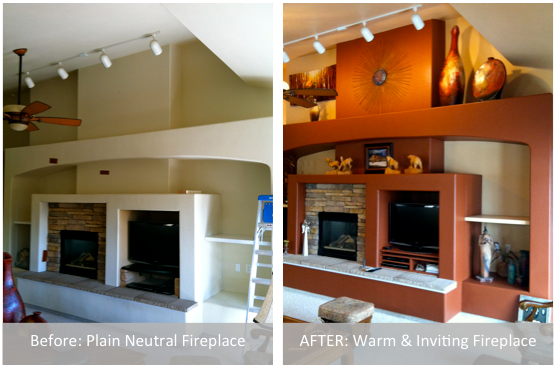
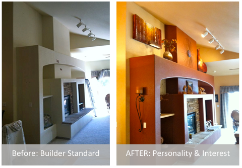
 We recently painted a fireplace for a homeowner and it completely transformed the space. Check it out!
 If you’re thinking of painting your fireplace here are a few tips:
- Does your fireplace have visual interest? If it seems boring or under scale, price out having a wood façade added to give it more presence.
- Is the fireplace a feature you want to highlight? When you go bold your eye and the attention of your guests will be drawn there. Make sure you’re ready to accessorize so the fireplace looks intentional.
- Choose a color you already have in your décor. If you already have accent colors in your decorating, place that color on your fireplace to pull it all together.
- Consider painting the surround a bold color and leaving the fireplace neutral. This can achieve the same effect.
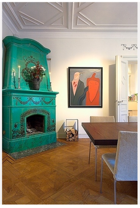
 For inspiration, check out our Pinterest Board: Painted Fireplaces.
Would you paint your fireplace surround a bold color? If so, what color would you do?
Must Know Painting Tips for Home Sellers
Everyone selling a residential property needs to know this!

Don’t put your home on the market without reading these tips.
Selling your home can be a large undertaking. Usually sellers are looking to put the home on the market investing the least amount of money while selling it for top dollar. Painting is on of the least expensive ways to improve buyer impression of your home.
We strongly recommend following the advice of a Realtor® when selling your home. Follow their advice over ours. That being said, we work with a lot of Realtors and their advice resonates with what we share.
1. Selling is about giving the buyer what THEY want. Not standing up for what you like. They need to be able to envision their stuff in your home. Remember, if all goes well, their stuff WILL be in your home and don’t expect them to keep the color on the walls as a shrine to you and your design savvy.
2. Smart color choices can loosen the pocket books of people in a competitive market. While we in no way promise increased profits or recouped costs when painting your home to sell, we’ve seen buyers lower their offers because they expect to have to paint over a poor paint job. We’ve also seen buyers swoon over a freshly painted home.
These paint DO’s and DON’Ts are essential to attracting buyers!
DON’T be emotionally attached to your personal color choices. If you painted a wall bright orange or even a bright purple like I have, don’t expect others to be as in love with it as you are. Your neon green bathroom with stenciled lizards may have worked for you, but will likely lower your sale price.
DO find inspiration and look through photos of upscale homes that use neutral paint colors. Neutral paint colors include tan, gray, beige, and sage/olive green. Notice how light or dark they go in each color. It’s unlikely there will be very light or dark extremes. And notice how they bring color in through accessories. Imitate as much as possible.
DON’T use white paint on your walls. It is cold and sterile and shows dirt. The house we bought was painted white inside. We started painting the interior a couple days before closing and the sellers stopped by. The walls were now a gray/beige color and we had done some accent walls. Their comment: “Wow! We should have painted these colors and asked $10,000 more!” Paint your walls a tan, beige, or gray color to warm things up.
DO leave your trim and doors white or stained. Again unless they are in bad shape and you’re replacing things, stick with what you have and save some money. Use a Magic Eraser to remove scuff marks. Use a 1:1 vinegar and water solution and a soft cloth to clean the doors and trim.
DON’T forget to look at your cabinetry. If it’s really outdated or cheap looking, consider painting and adding fresh hardware. People gravitate toward white cabinets or espresso (dark brown) finishes. It’s very popular among designers to paint the top cabinets white and the lower ones an espresso color.
DO paint closets. Scuff marks and other wear and tear look cheap. Clean and fresh is the name of the game here. (Bonus: You can use inexpensive paint here and get away with it.)
DO consider painting your front door an inviting color. A front door can be a focal point for the whole exterior. Colors like red or black can give a good impression.
As a professional painter we can help your home look crisp and fresh for home buyers. If your property is in the Colorado Springs area contact us and get your FREE estimate.

3 Best White Paint Colors
3 Best White Paint Colors | A Quality Paint Job
A Quality Paint Job Shares the SECRET!
We’ve painted a lot of things white over the last seven years. White can be dynamic and warm. Check out our Pinterest board White is NOT Boring for inspiration for your space.
The top three most popular white paint colors of our customers and designers are (Sherwin-Williams colors):
#1 Extra White (SW 7006) The crisp, go-with-everything-bright-as-day white. The neutral of whites.
#2 Dover White (SW 6385) A nice, warm white–a light cream color. Looks great on cabinets and furniture, and softens ceilings, trim, and doors.
#3 Snowbound (SW 7004) This is a gray-blue white. Works well against textile and wall colors with cool undertones or in rooms where the light is very yellow.
Did you find this post helpful? Show you care and click the “LIKE” button at the top or bottom of this post.
[Disclaimer: Color choice is an intensely personal choice. Please be sure to purchase and put samples on the wall or trim you plan to paint. The information we share is just to get you started.]